


As a frontend developer with nearly 15 years of experience, I’ve witnessed the evolution of web development firsthand. For me, it’s come a long way from the days of uploading modified files via FTP (yes, GitHub launched 15 years ago, but I only discovered it in 2011) to the modern era of responsive interfaces, UI libraries, and websites directly generated from Figma.
Yet, I still encounter projects that employ nested styles like:
.some-class ul li div a { /* some style */ }
or,
#nav .nav-link svg { /* some style */ }
It may seem shocking, but such coding practices pervade everything from multimillion-dollar, rapidly growing projects to humble startups.
Let’s delve into why this approach can pose problems.
The Conflict of Nested Styles
Deeply nested styles often lead to style conflicts, especially if you have a big project. CSS, as a cascading style sheet, cascades down and applies to elements depending on their specificity. Deeply nested styles can unintentionally override other styles due to their specificity.
Consider this example:
.some-class ul li div a { color: red; }
...
.some-class a { color: blue; }
You might expect all links in .some-class to be blue. However, because of the greater specificity of the first rule, any link nested within a ul > li > div will be red, not blue. This can lead to unexpected visual inconsistencies and lots of wasted time debugging.
The Complexity of Specificity
Understanding the concept of specificity (or the ‘weight’ of styles) in CSS is crucial to understanding why deep nesting can be troublesome. Specificity determines which CSS rule applies if multiple rules compete for a single element. It’s calculated based on the type and quantity of selectors.
Specificity is calculated based on a four-category weighting system:
- Inline styles
- IDs
- Classes, attributes, and pseudo-classes
- Elements and pseudo-elements
Here, consider the rule:
body #content .data img:hover { /* some style */ }
The specificity is 0 1 2 2. That’s one ID (#content), two classes (.data and :hover), and two elements (body and img).
Now, consider the rule:
#nav .nav-link svg { /* some style */ }
The specificity here is 0 1 1 1. That’s one ID (#nav), one class (.nav-link), and one element (svg).
Specificity doesn’t operate on a “carry-over” system like traditional decimal numbers. For example, a selector with a specificity of 0 1 0 11 is not equal to a specificity of 0 1 1 1 even though in a decimal system, 11 and 1+1 would be equivalent.
Finally, the universal selector (*), combinators (+, >, ~, ‘ ‘) and negation pseudo-class (:not()) have no effect on specificity. Inside the :not() argument, however, the selectors are counted as usual.
For visual learners, I recommend this video about CSS Specificity.
Understanding CSS specificity and how it is calculated allows you to write better, more predictable CSS and to debug issues when styles are not being applied as expected.
The !important Rule and Specificity
Sometimes, developers resort to using the !important rule when facing difficulties with CSS specificity conflicts. This rule makes a CSS property extremely specific, meaning it will override almost any other declaration.
For example:
#nav .nav-link svg { color: blue; }
.nav-link svg { color: red !important; }
Despite the first rule having a higher specificity due to the ID selector, the color of the svg would be red because of the !important in the second rule.
The Risks of Overusing !important
While !important can be a quick fix when struggling with specificity issues, it’s not recommended to use it extensively. Overuse can affect maintainability, predictability, and performance. In larger projects, the overuse of !important often indicates a struggle with managing CSS specificity. Rather than resorting to !important, it’s often better to invest time in refactoring your CSS and reducing the use of overly specific selectors.
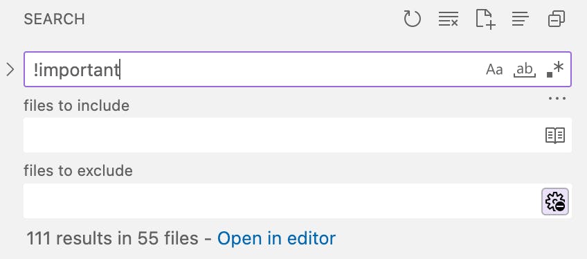
You can check your product right now ?. I have checked mine:

111 results in 55 files, not bad for a big product!
While !important might be a tempting quick fix; it’s like using a sledgehammer to crack a nut. A more maintainable approach is to keep your selectors as simple and as flat as possible, which makes your CSS easier to understand, manage, and extend in the future. And remember, the best way to win an !important war is not to start one in the first place.
Traversing the CSS Tree
Another problem with deeply nested styles is the performance impact on browser rendering. When a browser applies styles to an element, it traverses the DOM from right to left, starting with the key selector (in our examples, a and svg) and moving through the ancestors until it finds a match or reaches the top. The more nested the style, the longer this traversal takes, potentially affecting performance and slowing page load times in large-scale projects.
When you specify a CSS rule, like:
.some-class ul li a { /* some style */ }
You can visualize this rule starting from the bottom of the tree (from the a tag) and working its way up through the tree (via li, ul, and .some-class).
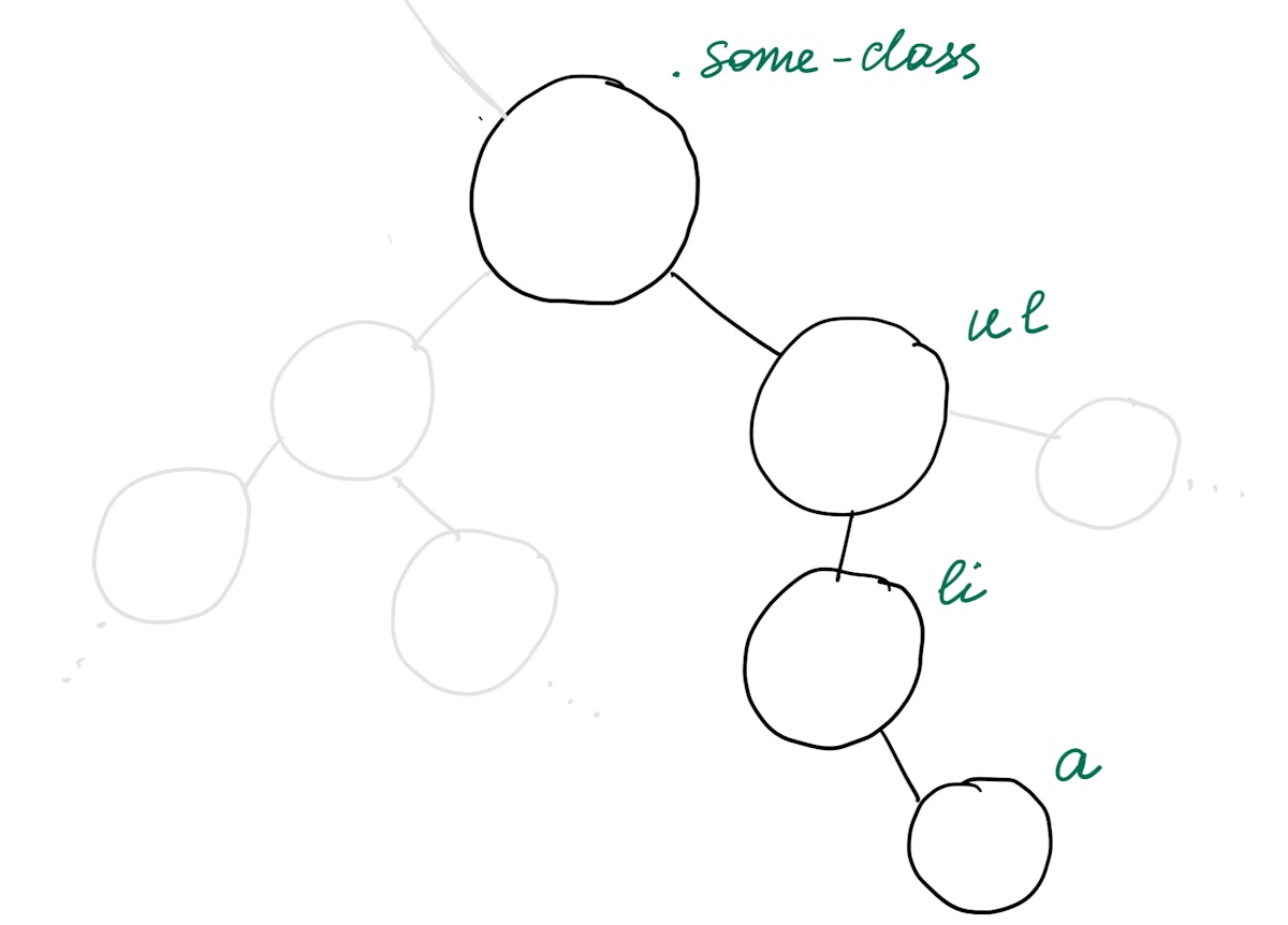
just a small part of CSS Object Model
The browser will first look for all (I mean ALL) a elements, then it will check if these atags are inside li elements. After that, it will check if these li elements are inside ul And lastly, it will check if these ul are inside an element with the class of .some-class.
This is how browsers read CSS selectors and the reason why complex selectors can lead to slower page rendering. The browser has to make multiple checks for each element to see if it fits the specified rule. The deeper the rule, the more checks the browser has to make, which can impact performance.
Better Practices for Managing CSS in Larger Projects
CSS Modules
CSS Modules allow you to write CSS in individual modules, which are scoped locally to the component you’re working on. This means that styles in a CSS module are only applicable to that specific module and won’t leak out or affect other elements on the page.
Let’s explore how CSS Modules use hashed class names to ensure style encapsulation. When you’re using CSS Modules, the class names you define in your CSS file will be hashed at compile time. This hash creates a unique class name that corresponds to your component. Let’s take a look at an example:
Suppose you have a CSS Module defined as such:
/* Button.module.css */
.button {
  color: white;
  background-color: blue;
}
And you use it in your component like this (I prefer importing the styles object as sinstead of styles — a quick tip that saves typing time and boosts coding efficiency):
import React from 'react';
import s from './Button.module.css';

const Button = () => {
  return (
    <button className={s.button}>Click me</button>
  );
};

export default Button;
When your application is compiled, your rendered HTML might look something like this:
<button class="Button_button__3FQ9Z">Click me</button>
In this case, Button_button__3FQ9Z is the hashed class name that was generated from your CSS Module. Note that the exact structure and length of the hash can vary based on your project configuration.
This unique class name ensures that the styles you’ve defined in Button.module.css only apply to this button and won’t affect any other elements in your application. It also ensures that no other styles can affect this button unless they explicitly target the hashed class name. This encapsulation of styles is one of the main benefits of CSS Modules.
CSS-in-JS Libraries
Another popular way to handle CSS is by using CSS-in-JS libraries, such as styled-components or emotion. These libraries allow you to write your CSS directly within your JavaScript, which has several benefits:
- Scoped styles: Similar to CSS Modules, styles are scoped to the component they’re defined in.
- Dynamic styles: It’s easy to create dynamic styles based on props or state in your component.
- Improved developer experience: You can use JavaScript logic directly in your styles, and everything related to a component is located in one place, which can make your code easier to understand and work with.
Here’s an example of how you might use styled-components in a React application:
import React from 'react';
import styled from 'styled-components';

const Button = styled.button`
  color: white;
  background-color: ${(props) => props.primary ? 'blue' : 'gray'};
`;

const App = () => {
  return (
    <div>
      <Button primary>Primary Button</Button>
      <Button>Secondary Button</Button>
    </div>
  );
};

export default App;
In this example, the Button component has dynamic styles that change based on its primary prop.
BEM Methodology
If you’re not working with a JavaScript framework that supports CSS Modules or similar, you can still manage your CSS effectively using naming methodologies like BEM (Block, Element, Modifier).
BEM stands for “Block Element Modifier,” and it’s a methodology that helps you to create reusable components and code sharing in CSS. Here’s how you might structure your CSS using BEM:
/* Block */
.top-menu {

}

/* Element */
.top-menu__item {

}

/* Modifier */
.top-menu__item_active {

}
In BEM, the ‘Block’ is the standalone entity that is meaningful on its own, the ‘Element’ is a part of the Block that has no standalone meaning and is semantically tied to its Block, and the ‘Modifier’ is a flag on a Block or Element that is used to change appearance or behavior.
Using a consistent methodology like BEM can make your CSS easier to understand and maintain, particularly on larger projects.
In Conclusion
There are several ways to manage CSS in larger projects, from CSS Modules and CSS-in-JS libraries to naming methodologies like BEM. The key is to find an approach that fits well with your team and project and to apply it consistently. Remember, writing CSS is as much about writing code that is efficient and performant as it is about writing code that is understandable and maintainable.
Happy coding!
The Web Development Writing Contest is brought to you by IONOS in partnership with HackerNoon. Publish your stories on #web-development to win from $6000!!!
Experience coding the way it’s meant to be with IONOS Cloud Cubes – powerful KVM-based virtual servers designed for maximum flexibility and on-demand scalability. Start for free: IONOS virtual servers for devs.
This article was originally published by Olga Stogova on Hackernoon.


