


The complexity of modern websites has grown significantly over the past few years. The increased demand for high-quality, industry-standard designs further intensifies the challenges faced by frontend developers.
Today, even frontend apps need some architectural considerations to streamline the development process. In my previous article, I shared my experience implementing the clean architecture approach in front-end applications while working on my side project.
In this article, I aim to delve deeper into the atomic design approach, drawing from my experiences with the same project. I will discuss its advantages and disadvantages, and evaluate its usefulness in different scenarios.
Background on design systems
To begin, let’s explore the concept of a design system. Design systems are comprehensive collections of reusable components, guidelines, and principles that empower teams to design and develop consistent user interfaces across multiple platforms.
They act as a single source of truth for both designers and developers, ensuring that the visual and functional aspects of a product align and adhere to the established brand identity. If you’re interested in exploring examples of design system implementations, consider examining the following:
If you want to dive deeper into the topic of design systems I recommend checking out this article. It describes this topic in detail, details that are not required for us in the scope of this work.
How atomic design is derived from design systems
Building on the foundation of design systems, atomic design is a methodology that streamlines the organization and structuring of reusable components and guidelines. Conceived by Brad Frost, Atomic Design is inspired by chemistry, as it deconstructs user interfaces into their most fundamental building blocks and reassembles them into more intricate structures.
Here’s an image illustrating the analogy to chemistry:
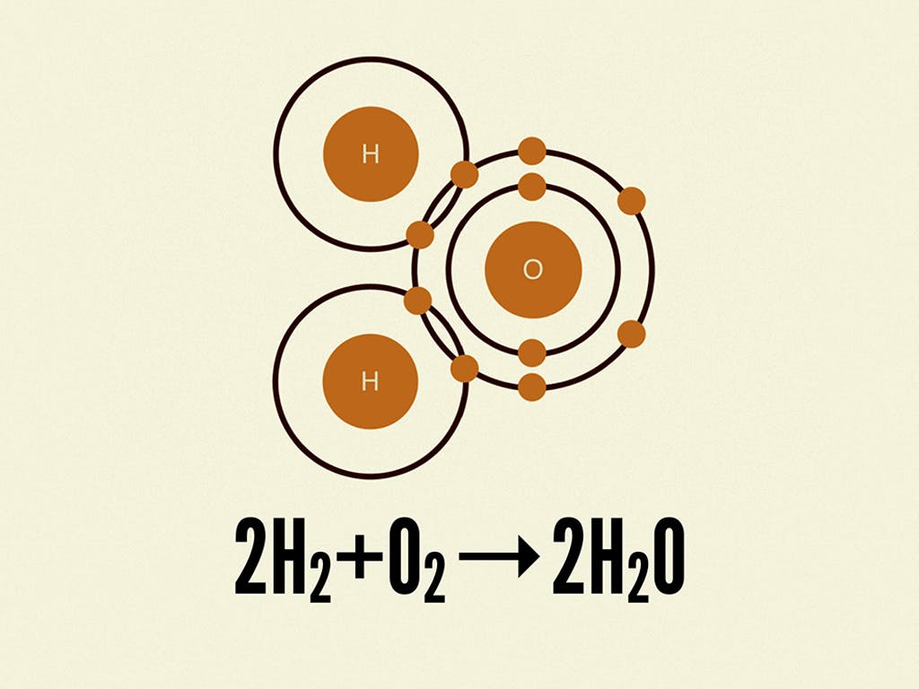
An example of a chemical equation showing hydrogen and oxygen atoms combining together to form a water molecule.
Chemical reactions are represented by chemical equations, which often show how atomic elements combine together to form molecules. In the example above, we see how hydrogen and oxygen combine together to form water molecules.
In essence, atomic design is a natural evolution of design systems, providing a systematic approach to creating flexible and scalable components. By applying the principles of atomic design, teams can manage their design systems more efficiently, as the modular nature of this methodology makes it easier to maintain, update, and extend the components and patterns within the system.
If you’re concerned that this may sound complex, don’t worry. In the upcoming sections, I’ll demonstrate how to apply these principles using a real-life example from the app I’ve developed, making it easy to understand and implement in your own projects.
Overview of atomic design
The atomic design organizes components into five distinct levels, each building upon the previous. Let’s explore these five levels in detail:
- atoms: the most basic building blocks of a user interface, atoms represent individual HTML elements such as buttons, input fields, and headings. They are the smallest functional units and cannot be broken down further.
- molecules: molecules are formed by combining two or more atoms into a functional group. For instance, a search form molecule might consist of a search input atom, a button atom, and a label atom. Molecules represent simple components that can be reused across a project.
- organisms: organisms are more complex components, created by combining multiple molecules and/or atoms. They represent distinct sections of a user interface, such as a header, footer, or sidebar. Organisms help to form the overall layout and structure of a page.
- templates: templates are essentially page layouts built using organisms, molecules, and atoms. They define the structure and arrangement of components on a page without specifying any actual content, serving as a blueprint for various content scenarios.
- pages: pages are the final, fully realized instances of templates, complete with real content and data. They represent what users will ultimately see and interact with, showcasing how the components and layout adapt to different content types and use cases.
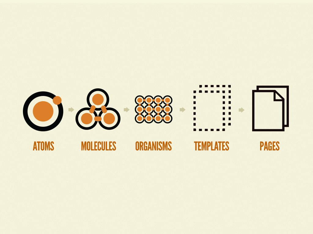
Atomic design is atoms, molecules, organisms, templates, and pages concurrently working together to create effective interface design systems.
The NotionLingo app: a case study
In order to develop a well-informed perspective on atomic design for frontend development, I embarked on a journey to create an application. Over a period of six months, I gained valuable insights and experience while working on this project.
Consequently, the examples provided throughout this article draw from my hands-on experience with the application. To maintain transparency, all examples are derived from publicly accessible code.
You can explore the final result by visiting the repository or website itself.
Keep in mind, I’ll be using examples coded in React. If you’re not familiar with this language, don’t worry – I’ve aimed to illustrate the fundamental concepts of atomic design, rather than focusing on the nitty-gritty details of the code.
Atoms
To get a better understanding of the components in my repository, you can find them under the following directory: /client/presentation. In this location, I created a new directory called atoms to maintain consistent naming with the atomic design methodology. This new directory contains all the small pieces needed to build the entire onboarding process.
The full list of atoms is as follows:
atoms
??? box
??? button
??? card
??? card-body
??? card-footer
??? container
??? divider
??? flex
??? form-control
??? form-error-message
??? form-helper-text
??? form-label
??? heading
??? icon
??? input
??? list
??? list-icon
??? list-item
??? spinner
??? tab
??? tab-list
??? tab-panel
??? tab-panels
??? tabs
??? text
These atom names may be familiar to you since they are based on the Chakra UIpackage. Most of them already contain the default matching style for my application, so there isn’t anything particularly unique to describe at this level. With that in mind, we can proceed directly to discuss the molecules.
Molecules
At this stage, the atomic design process becomes more interesting and its true power starts to reveal itself. While defining your base atoms may have been a time-consuming and monotonous task, building new components using atoms becomes much more enjoyable.
To define the molecules, I created a molecules directory inside of my /client/presentation directory. The full list of required molecules is as follows:
molecules
??? available-notion-database
??? full-screen-loader
??? input-control
??? onboarding-step-layout
??? onboarding-tab-list
Indeed, with just five molecules, we have enough components to accomplish our goal. It’s important to note that this is also an ideal place to include shared layouts built upon other atoms. For instance, the onboarding-step-layout is utilized to maintain a consistent appearance throughout all five steps of the onboarding process.
The other components are as follows:
- available-notion-database: Used to display the fetched user’s database details (users may have multiple databases, so I provide the ability to pick one in step 4).
- The component appears on the UI like this:
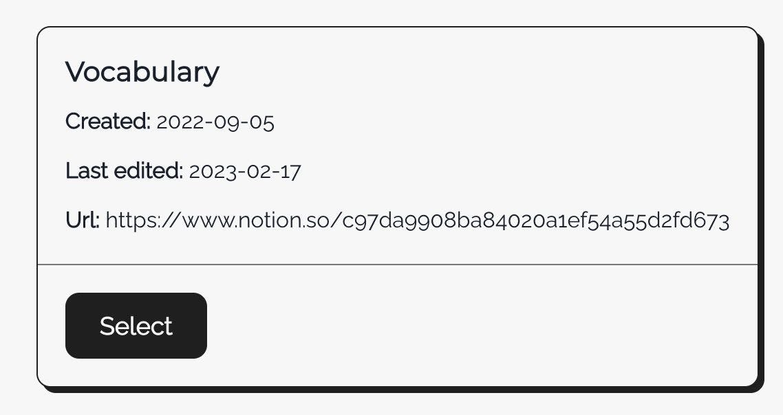
AvailableNotionDatabase component with header and base pieces of information about Notion database.
- full-screen-loader: Used at the very beginning when I’m fetching user details to check if the user has already defined Notion integration or not. The code for this component looks like this:
import { FC } from 'react';
import { Flex, Spinner } from '@presentation/atoms';
import { FullScreenLoaderProps } from './full-screen-loader.types';

export const FullScreenLoader: FC<FullScreenLoaderProps> = ({
  children,
  ...restProps
}): JSX.Element => (
  <Flex
    alignItems="center"
    bg="gray.50"
    height="full"
    justifyContent="center"
    left={0}
    position="fixed"
    top={0}
    width="full"
    zIndex="9999"
    {...restProps}
  >
    <Spinner />
    {children}
  </Flex>
);
There’s no rocket science here. This is just a combination of the already defined flexand spinner atoms.
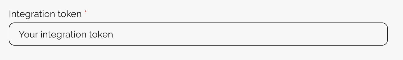
- input-control: A wrapper for the
inputatom withform-label,form-control,form-error-label, andspinnerto show whether there is some background action happening. The component appears on the UI like this:

InputControl component with the label.
- onboarding-tab-list: This is basically a step component, but in my case, I’m using Chakra UI tabs for navigation, so that’s where the name comes from. The component appears like this:

OnboardingTabList component is used to show progress in the onboarding process.
Now that more pieces are ready, we can move on to defining larger blocks in our design puzzle.
Organisms
This section is where I create each component responsible for displaying each step of the onboarding process.
To clarify things, I’ll just show you the list of created organisms:
organisms
??? onboarding-step-one
??? onboarding-step-two
??? onboarding-step-three
??? onboarding-step-four
??? onboarding-step-five
I believe the names are self-explanatory, and there should be no misunderstandings. To illustrate how I put everything together, I will present the code of one step as an example. Of course, if you want to check more, just visit my repository.
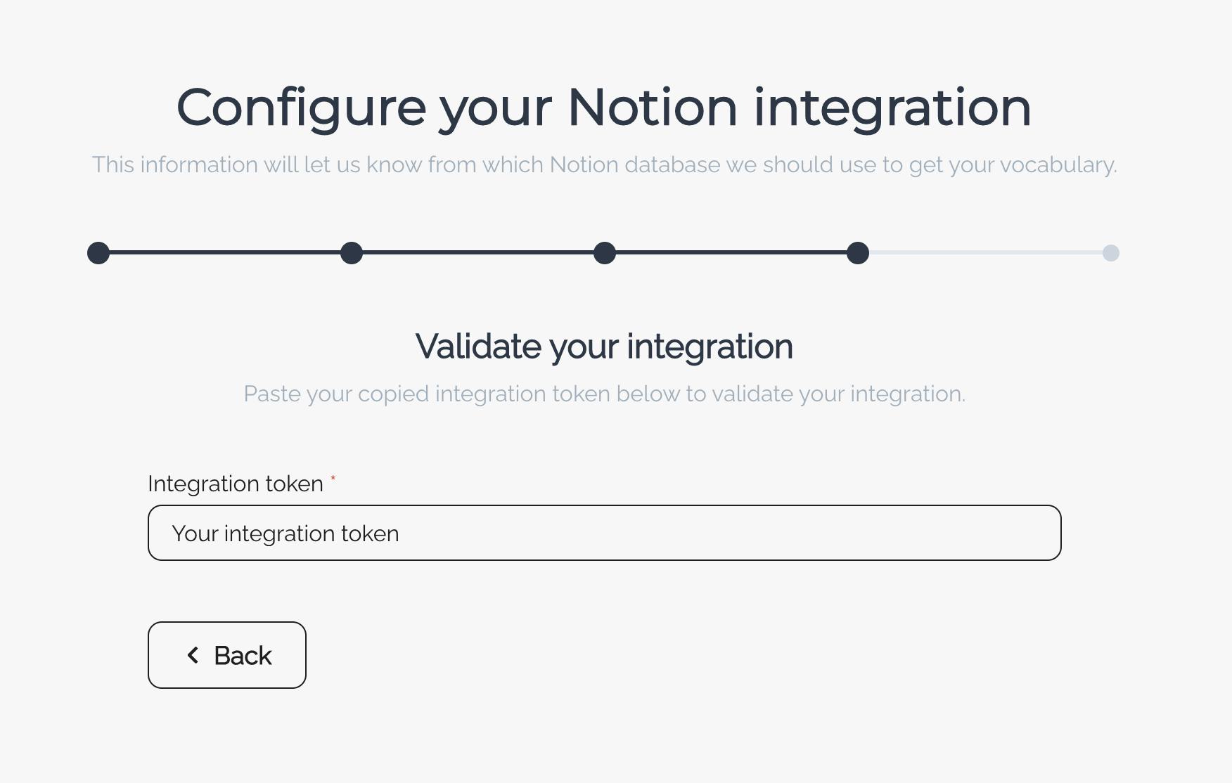
export const OnboardingStepFour: FC<OnboardingStepFourProps> = ({
  onBackButtonClick,
  onNextButtonClick,
}): JSX.Element => {
  const { hasApiTokenData, isSetApiTokenLoading, setApiToken, setApiTokenError } = useSetApiToken();

  const handleInputChange = debounce(async (event: ChangeEvent<HTMLInputElement>) => {
    const result = await setApiToken(event.target.value);

    if (result) {
      onNextButtonClick();
    }
  }, 1000);

  return (
    <OnboardingStepLayout
      subtitle="Paste your copied integration token below to validate your integration."
      title="Validate your integration"
      onBackButtonClick={onBackButtonClick}
    >
      <InputControl
        isRequired
        errorMessage={setApiTokenError || undefined}
        isDisabled={isSetApiTokenLoading || hasApiTokenData}
        isLoading={isSetApiTokenLoading}
        label="Integration token"
        name="integrationToken"
        placeholder="Your integration token"
        onChange={handleInputChange}
      />
    </OnboardingStepLayout>
  );
};
This code is entirely responsible for displaying step four in my onboarding process. I believe the only concern you might have is about making requests in organisms. Is this acceptable? There isn’t a one-size-fits-all answer, and I need to respond to these concerns with “It depends”. It depends on your structure.
If including an API call within a molecule or organism makes sense in the context of your application and does not overly complicate the component, it can be an acceptable solution. Just be cautious not to let presentation components become too tightly coupled with data-fetching or business logic, as it can make them more challenging to maintain and test.
In my scenario, this component is used in one place, and other solutions for performing an API call in that scenario are more complex and might produce way more code than necessary.
Templates
At this stage, the focus is on the structure and arrangement of the components rather than on the finer details of the UI. Templates also help to identify where state management should reside, which is usually in the page components that use the templates.
In the provided code example, we have an Onboarding component that serves as a template:
import { FC } from 'react';
import { Flex, Heading, TabPanels, Tabs, Text } from '@presentation/atoms';
import { OnboardingTabList } from '@presentation/molecules';
import {
  OnboardingStepFive,
  OnboardingStepFour,
  OnboardingStepOne,
  OnboardingStepThree,
  OnboardingStepTwo,
} from '@presentation/organisms';
import { OnboardingProps } from './onboarding.types';

export const Onboarding: FC<OnboardingProps> = ({
  activeTabs,
  createNotionIntegrationTabRef,
  displayCreateNotionIntegrationTab,
  displaySelectNotionDatabaseTab,
  displayShareDatabaseIntegrationTab,
  displayValidateIntegrationTab,
  displayVerifyDatabaseTab,
  selectNotionDatabaseTabRef,
  shareDatabaseIntegrationTabRef,
  validateIntegrationTabRef,
  verifyDatabaseTabRef,
}) => (
  <Flex direction="column" overflowX="hidden" px={2} py={{ base: '20px', sm: '25px', md: '55px' }}>
    <Flex direction="column" textAlign="center">
      <Heading
        color="gray.700"
        fontSize={{ base: 'xl', sm: '2xl', md: '3xl', lg: '4xl' }}
        fontWeight="bold"
        mb="8px"
      >
        Configure your Notion integration
      </Heading>
      <Text withBalancer color="gray.400" fontWeight="normal">
        This information will let us know from which Notion database we should use to get your
        vocabulary.
      </Text>
    </Flex>
    <Tabs
      isLazy
      display="flex"
      flexDirection="column"
      mt={{ base: '10px', sm: '25px', md: '35px' }}
      variant="unstyled"
    >
      <OnboardingTabList
        activeTabs={activeTabs}
        createNotionIntegrationTabRef={createNotionIntegrationTabRef}
        selectNotionDatabaseTabRef={selectNotionDatabaseTabRef}
        shareDatabaseIntegrationTabRef={shareDatabaseIntegrationTabRef}
        validateIntegrationTabRef={validateIntegrationTabRef}
        verifyDatabaseTabRef={verifyDatabaseTabRef}
      />
      <TabPanels maxW={{ md: '90%', lg: '100%' }} mt={{ base: '10px', md: '24px' }} mx="auto">
        <OnboardingStepOne onNextButtonClick={displayCreateNotionIntegrationTab} />
        <OnboardingStepTwo
          onBackButtonClick={displayVerifyDatabaseTab}
          onNextButtonClick={displayShareDatabaseIntegrationTab}
        />
        <OnboardingStepThree
          onBackButtonClick={displayCreateNotionIntegrationTab}
          onNextButtonClick={displayValidateIntegrationTab}
        />
        {activeTabs.validateIntegration ? (
          <OnboardingStepFour
            onBackButtonClick={displayShareDatabaseIntegrationTab}
            onNextButtonClick={displaySelectNotionDatabaseTab}
          />
        ) : null}
        {activeTabs.selectNotionDatabase ? (
          <OnboardingStepFive onBackButtonClick={displayVerifyDatabaseTab} />
        ) : null}
      </TabPanels>
    </Tabs>
  </Flex>
);
This Onboarding component assembles atoms, molecules, and organisms to create the layout for the onboarding process. Notice that the state management and tab navigation logic has been separated from this component. The necessary state and callback functions are now received as props, allowing a higher-level “page” component to handle state and data management.
This separation of concerns keeps the template focused on the layout and structure while ensuring that state management is handled at the appropriate level.
In the end, I would like to present step 4 as a final result:
Pages
In the context of our previous discussion, the “page” component uses the Onboarding template and handles state management for the onboarding process. While the code for this specific page component is not provided here, you can find it in my repository. As mentioned, there’s nothing extraordinary about the page component’s code; it primarily focuses on managing the state and passing it down to the Onboarding template.
If we have a look at what atomic design looks like in practice. Let’s dive into the pros and cons of this approach.
No rose without thorns
While atomic design offers numerous obvious benefits, such as modularity, reusability, and maintainability, it also comes with a few disadvantages that are worth considering at the beginning:
- initial setup and complexity: atomic design requires a well-planned structure and organization, which can be time-consuming and challenging to set up initially. It may also introduce additional complexity to your codebase, especially for smaller projects where such a granular approach may be unnecessary.
- learning curve: for developers new to atomic design, the methodology may have a steep learning curve. It requires a solid understanding of the different levels and how they fit together, which could be overwhelming for beginners.
- overhead: implementing atomic design might involve creating a large number of small, specialized components. This can lead to increased overhead in managing and maintaining these components, particularly when a component is only used in one specific context.
- risk of over-engineering: with the focus on creating reusable and modular components, there’s a potential risk of over-engineering, where developers may spend too much time refining individual components instead of focusing on the broader application.
- communication and collaboration: the success of atomic design depends on clear communication and collaboration between designers, developers, and other stakeholders. Failing to establish a common language or understanding of the methodology can lead to confusion and inconsistencies in the implementation.
However, this approach has its own already-mentioned strengths. Let’s talk about them in more detail:
- scalability: by decomposing the design into the most fundamental elements, building up the complexity of components became a more manageable task. While crafting atoms posed some challenges, creating any components based on these atoms was extremely enjoyable.
- efficiency: the ability to reuse atoms, molecules, and organisms significantly cuts down the time spent on designing and developing new features. Once the base components are established, creating new interfaces can be as simple as combining existing elements.
- consistency: comes directly from the previous point. Since the same atoms, molecules, and organisms are used across multiple templates and pages, the user interface remains uniform, providing a seamless experience for users.
- documentation: atomic design inherently supports documentation. The atom-based structure can serve as a clear, visual guide for how components should be built and used. This can be especially helpful for onboarding new team members.
- maintainability: one of the greatest strengths of atomic design is how it contributes to the maintainability of a design system. By breaking everything down into its atomic parts, any changes or updates can be made at the atomic level and then propagated through the system. For example, if you decide to change the color of a button, you only need to make this change once at the atom level, and it will be reflected across all the molecules, organisms, and templates where this button is used. This greatly simplifies the process of updating and maintaining the design system over time.
This article was originally published by Pawe? Wojtasi?ski on Hackernoon.


