

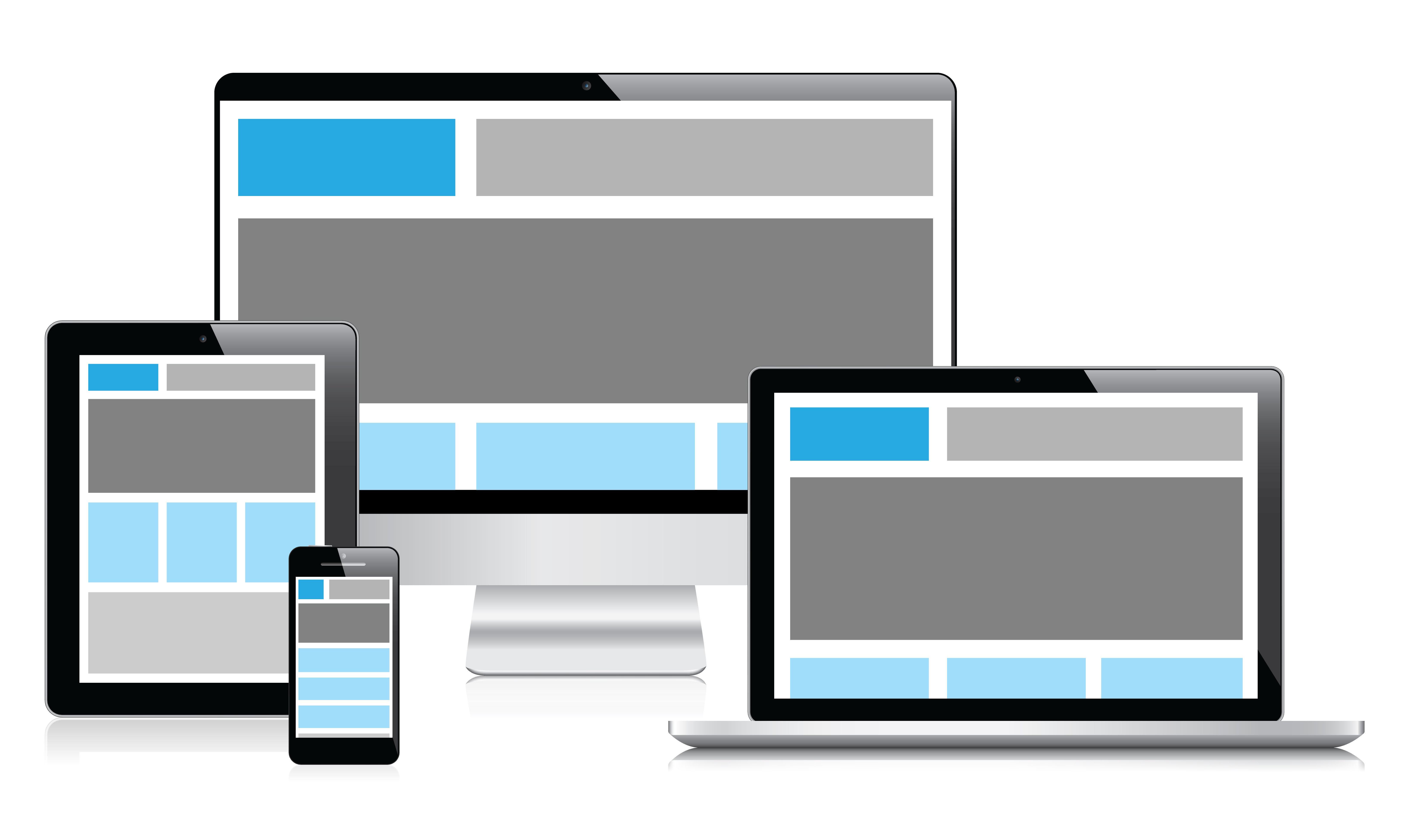
Building a winning website will take plenty of meticulous planning and analysis of your target market. It also requires tools that can help you along the way. One of the most important aspects of a modern website is the responsive design. You want your website to look just as good whether the person is visiting it sitting in front of a PC or relaxing on the couch browsing on mobile. To guarantee your web design is responsive, you need to utilise these 10 must-have tools.
Gumby 2
One of the best responsive tools to get started with is Gumby 2. The software is a framework for responsive design that is both easy to use and easy to download. You can instantly start customising the framework to your site’s specific needs and you don’t need to be a tech-wizard to do this.
Gumby 2’s features include the ability to transform images and intrinsic ratio video embeds into responsive sizes and a collection of robust grid tools. These allow you to customise your buttons, toggles and templates and ensure the visitor doesn’t miss information and design.
InVision App
If you have a number of members in your web design team, then using the InVision App will be useful. The app allows you to showcase and communicate the different design changes in an eloquent and in an easy-to-understand manner. One of the highlights of the app is the ability to send clickable designs to a phone via SMS. What this means is that you can easily test the site’s design viability in real life. The app used to just have iOS support but Android support has now been announced as well.
Wirefy
You definitely want to consider trying out Wirefy because of its ability to design responsive web designs for all sorts of platforms and websites. The software works especially well if you are connected with the content first at the base.
However, you do require a bit of coding knowledge to take full advantage of this tool. If you aren’t familiar with CSS or HTML, you might want to spend some time learning them or skip this tool for an easier alternative on the list.
Bootstrap
One of the most popular responsive tools out there is Bootstrap and it isn’t a surprise. The software is rather easy to use and it provides you with plenty of simple configurable front-end framework options to use. The whole platform is designed with the latest browsers in mind so it is a modern and functional tool to use.
Marvel
You can also benefit a great deal from this online tool. Marvel can be used to create prototypes of mobile applications and different web projects. You can easily turn your ideas from sketches and mock-ups into actual mobile and web prototypes. It’s perfect for pitching your ideas and showing how well they could work. However, the app does require some coding knowledge.
Adobe Edge Inspect
When it comes to checking out how responsive your site is, the Adobe Edge Inspect tool will come in handy. The software allows you to view your site just as it would show on a range of different devices and screen sizes. You don’t need to have that actual device in order to know how well your site will look! The system currently provides views for iPads, Droid X, iPhone, Galaxy Nexus and many more similar devices.
Gridset
Gridset is a great responsive design tool because it works well with plenty of content management tools. If you are using Joomla, Drupal or WordPress, you can add this software on your site and start utilising its features without a hitch. The tool also works with graphic applications such as Photoshop.
With Gridset, you are able to design responsive layouts for your site, create prototypes of your design and create fully customised layouts. It allows the creation of all sorts of grids, such as the regular columnar grids.
Export Kit
Now, there has been plenty of talk of other photo design software replacing Photoshop. However, this isn’t that likely to happen and the Export Kit continues the success of creating Photoshop designs and then utilising them as a website or even an application. Indeed, the software allows you to link your project and the code by converting the Photoshop file instantly to HTML, CSS, JS, or WordPress.
Adobe Edge Reflow
As an Adobe product, the Edge Reflow is great at creating responsive designs that are also visually pleasing. The software allows you to instantaneously convert the Photoshop files to content into HTML and CSS. You can then keep readjusting the design to make it perfect for your needs with this tool. While the software is essentially just a visual design tool with plenty of drag and drop functionality, it will require some basic HTML and CSS knowledge.
UxPin
For advanced users, the collaborative tool by UxPin is worth giving a go. The design tool makes it easy to create wireframes and prototypes that are interactive and responsive. The tool offers a range of custom UI elements and there are plenty of options for traditional and experimental designs.
With the help of the above tools, you can instantly create beautiful, responsive websites. To find if you can save on the above tools, you can also explore OZCodes.com.au offers from different retailers such as Adobe, which can help you get your desired tool within your budget.
