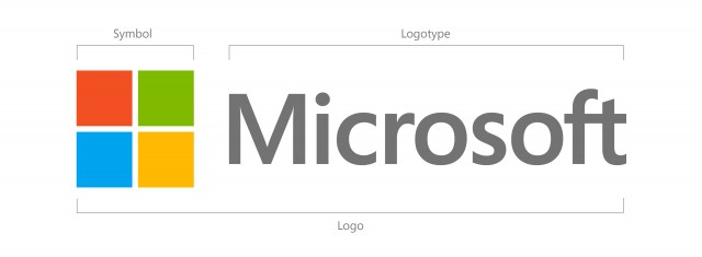
Microsoft on Thursday updated its corporate logo — changed for the first time in a quarter of a century.
Unveiled at the Boston opening of the company’s 23rd Microsoft store this morning, the new mark retains the same color scheme as its predecessor, but swaps out its wavy edges for the straight lines of a simple four-pane colored window, reminiscent of the tiled look of its new Windows Phone and Windows 8 operating systems.
“From Windows 8 to Windows Phone 8 to Xbox services to the next version of Office, you will see a common look and feel across these products providing a familiar and seamless experience on PCs, phones, tablets and TVs,” Microsoft exec Jeffrey Meisner said in a company blog post. “This wave of new releases is not only a reimagining of our most popular products, but also represents a new era for Microsoft, so our logo should evolve to visually accentuate this new beginning.”


