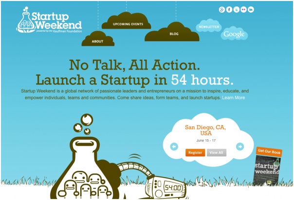
Startup companies, as a rule, are in search of their own business model, looking for investment partners to develop their ideas. In recent years the Internet has become a platform for such businesses. There are many start-ups, some of which are happily moving in the right direction, for example, designcontest.com logo design, one of the most effective design start-ups, while others are not so successful. Some of them are doomed to fail, while others – to achieve great success and bring huge profits to their partners and investors. Today, this phenomenon can be seen as a kind of ideas marketplace.
Let’s consider the most notable start-up concepts, which are represented in the Internet by excellent web designs of their websites.
eRated
It’s a special solution of credit scoring for P2P transactions. This platform is a large fragmented market, which employs about 100 million merchants and 1,000 trading grounds trading platforms around the world. The design of the site is a full-screen dynamic image, remembering that each of us is always in the way. The image a mobile device in the foreground looks implausible, but it gives a certain charm to the design.
LaMetric
It’s a ticker for personalization of the settings of all that happens in your life and business. It tracks a variety of events:
- Current weather and weather forecast.
- A topic and time the next meeting.
- Titles and the number of e-mail messages, and much more.
The stylish and flat design of the site uses an image that covers the entire page width. As for the title – it’s made of a white text. When scrolling down, one can see that the rest of it has a similar character.
Dynamic Yield
It’s an Israeli company found in 2012. Dynamic Yield is a platform for real-time personalization and optimization of websites. The service helps marketers to create commercially successful landing pages for businesses promotion.
The platform provides the ability to quickly make decisions, manage data easily, and customize CMS. The design is quite minimalist and simple, with a central idea of freedom and ease of doing businesses, symbolized in specific schematic elements.
Proximus
It’s a startup for helping retailers and brands to monitor consumer databases. It literally shows which of your stores are visited more often, as well as what kind of activity users do there. The design of the landing page is presented by only two colors – white and blue. The main point of such design is a flat approach and hollow ghost buttons.
Magnific
This London-based company proposes the creation of content and services of viral marketing for businesses. The design is made in a very dark color with bright colored elements.
Avuba
Avuba is an application for mobile electronic bank account, which allows you easily and quickly carry out such online banking operations as money transfer and paying bills. It also provides a tracker to monitor the way you spend your money.
So you can save a considerable amount of time for your financial affairs. The design uses white and green color scheme All in all it strengthens your belief that the application is easy to use.
Lingvist
Lingvist is an adaptive application for learning foreign languages. The developers claim that their platform accelerates language learning by 10 times. The web design is made with rich green color, but it’s quite minimalistic.
Pubble
Pubble collects questions and answers of your clients with the help of special algorithms. Thus, you can make your own customer knowledge base. By clicking on the previous indexed questions and answers that have been given by the clients (e.g., on the website, or on the micro blog), everyone can find the answer to the previously asked questions.
The design of the site uses dark background image of London with a transparent unit of a white text. The rest of the space is flat-designed with an unobtrusive presence of a few animation effects.
Spatch
It’s a communication platform, which analyzes the content of email messages and events that require your response. The application appears as heading and buttons at the top of the message. One can use Spatch unilaterally. i.e. a recipient does not necessarily have to install the same software on his gadget.
The web site design uses a simple interface, symbolizing the ease of the application use.
Cruise
Cruise created the first automatic pilot for the highway, which can be installed on your car. With the help of vision technology and sensors, you can keep your car at a safe distance from the vehicles going ahead.
The design is a complex structure, with a touch of simplicity and some wonderful effects: scroll down the page to turn on the lights.
Shortcut
It’s an application for eCommerce on the meetings. The toolbar helps customers to order food products directly from their seats, without leaving the room.
The design is flat and minimalist, repeatedly reinforcing the idea of easy use.
Zzish
This is a service for the design of e-learning applications.
The design is made in purple, with a number of transparent layers, flat icons and video presentations.
Blockscore
BlockScore is an identification project for solving a problem of the identity theft. There’s a large background image of the urban landscape in the design, overlain by a blue filter. Central elements are transparent hexagons, white text, and ghost buttons.
Despite all the arguments that demonstrate the importance of design, it’s still somehow underestimated. Don’t forget that customers interact not with technologies, but with the graphical interface. Simple and functional organization of the visual component of a product is a key to a successful startup.


